LCHT
A brand I created for an organization called the Laboratory to Combat Human Trafficking, back between 2009-2011 while an intern and then a contract employee.

Brandi is a creative genius for non-profit organizations and human rights and social justice issues, blending her skills in strategic communications and branding.
— Amanda Finger, Executive Director, LCHT


Brand Book
You’re never going to see this many fonts used in a style guide, but it’s intentional. Read below for why.

Brand Application
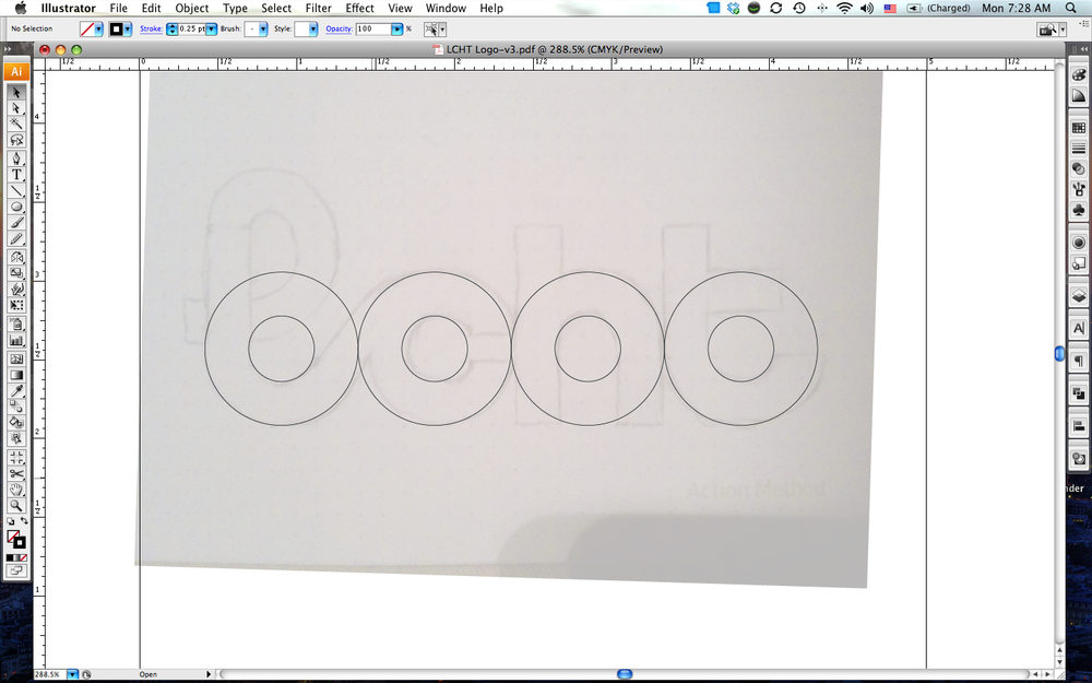
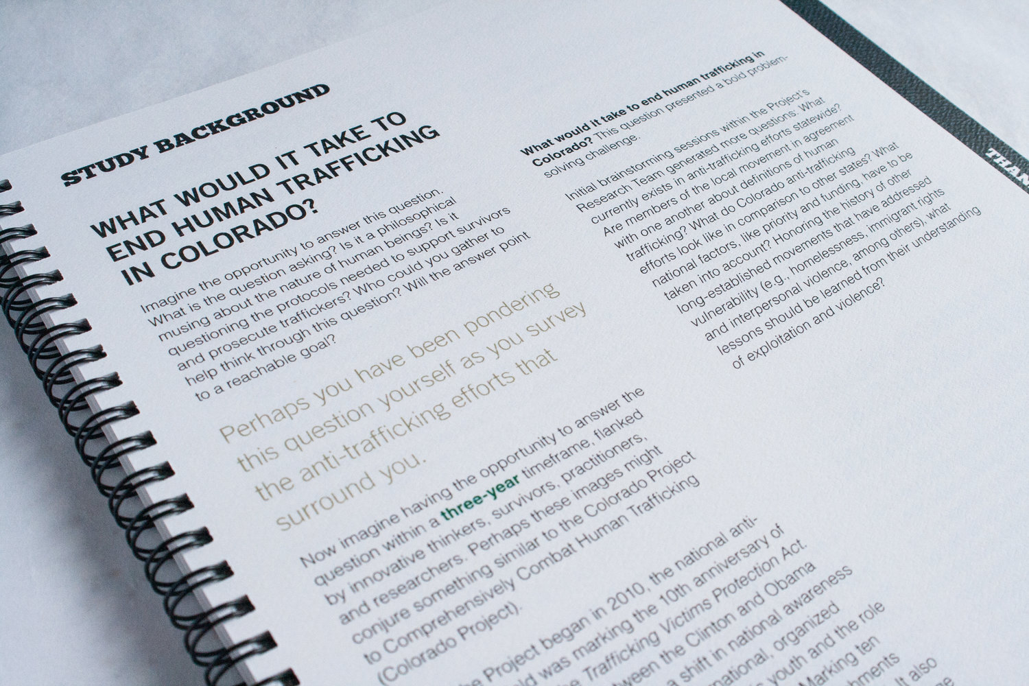
The concept for LCHT's brand emerged as a "re-imagining" of early abolitionist propaganda pieces, specifically posters. While LCHT does not identify as an "abolitionist" organization within the movement, we felt these posters provided the perfect historical context to "reclaim" these types of materials. These old posters also employ heavy use of fonts as graphic elements, several different styles & families of fonts, and little-to-no images. Because LCHT aims to be non-sensationalist, text as graphics keep the imagery at minimum, where it strays away from any shocking imagery or a single image or person as being representative of a trafficking survivor. This reasoning and framework also lent itself well to heavy reliance on infographics, which were later fleshed out more fully in the website and other collateral.
Stationery


Video Work
Script, copywriting, storyboarding, art direction, design, and motion concept by myself. Edited & produced by One Floor Up.
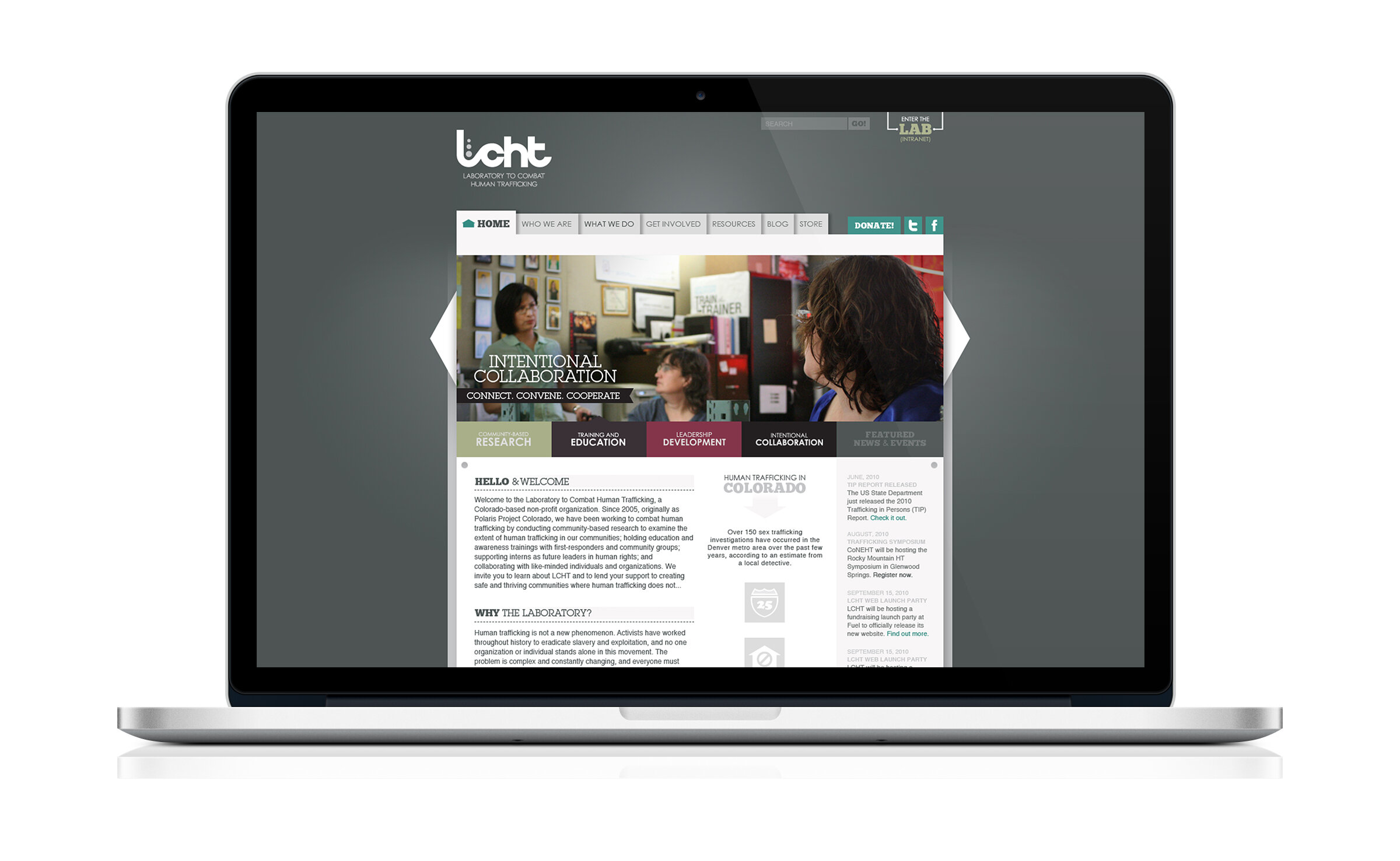
Website
Strategy, wire framing/site architecture, design by myself. Copywriting by myself and the LCHT staff. Design and development by HotPress Web, back when they were still called HotPress Web. LCHT’s website has since changed, but this is what it looked like originally.
Brochures
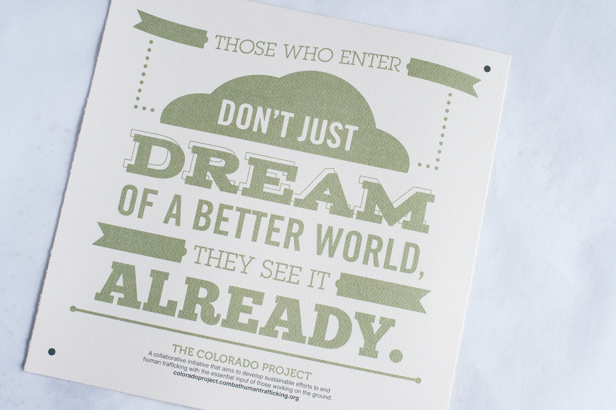
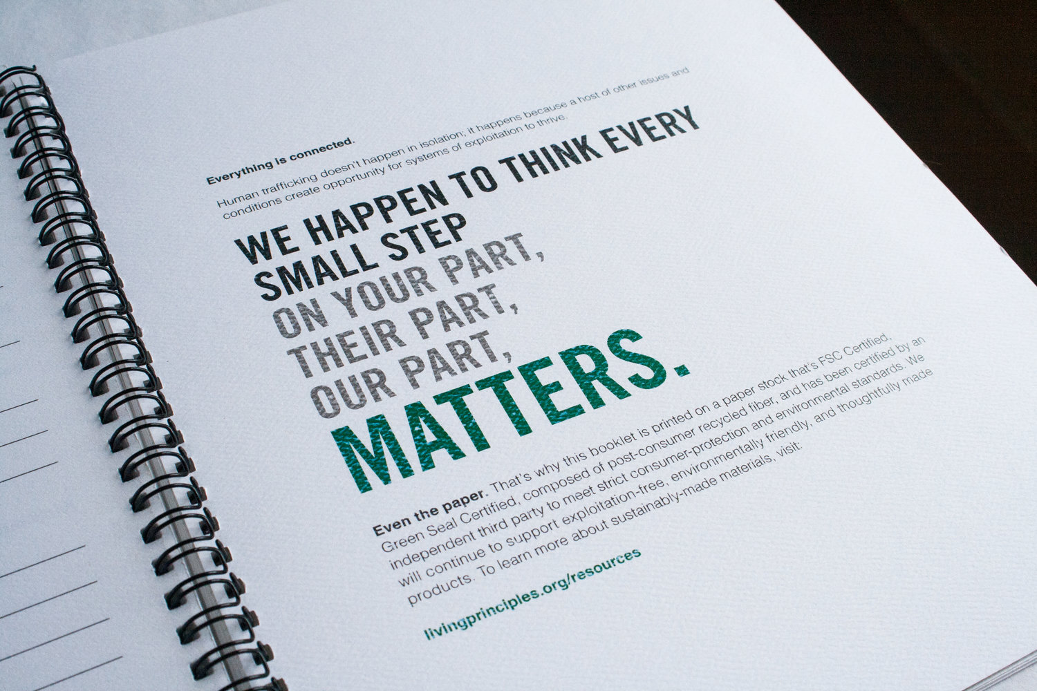
Rather than opting for newer methods of printing, we actually decided to run our brochures on a legitimate newspaper press. Not only did this give a nod to more traditional printing methods used in the time of anti-slavery efforts (the same way our type styling did), but it also created minor variations in printing across brochures. The added bonus? Newsprint is a significantly cheaper way to print four-color work than modern presses, making these not only a branding win, but a financial one, as well.


Additional Items


Event Design
The Colorado Project to Prevent Human Trafficking National & State/Local Conferences


Recognition
My work for LCHT was showcased on Branding Served, a site which features top work in categories such as identity, branding, and logo design. Served is a collection of sites that showcase category-specific content from Behance, the world’s leading platform for creative professionals across all industries. The Served curation team chooses projects that move creativity forward in their respective industries.

